Soul Full Psychotherapy
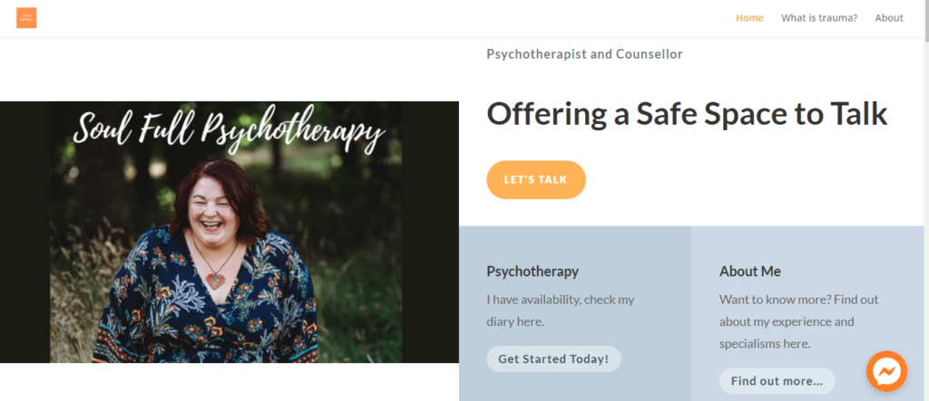
Designing a therapist website with an established niche, just like many others, starts with a discovery call and conversation about what the customer wants. In this case, the client is me and so I had to have those conversations with myself! What did I want it to feel like? Who is my audience? What are my brand colours and themes, and how do I build those in. The web site covers all the usual elements, including services, about me, contact and using calls to actions to invite users to get in touch or read more, and I wanted to develop an area of the site where readers could dig a little bit deeper. My niche is trauma, particularly adult survivors of childhood trauma and so I wanted to create content to support that. You can click on any of the images to visit the site and look around.
Making the Website Add Value
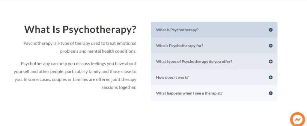
Often we can talk about complex subjects on our sites, and so I wanted to be able to show FAQ’s in a nicely designed way, making sure the user doesn’t have to trawl through all of them but can click the + sign to find out more about the question they have. This type of design module could be used for offering different sessions, training or workshops, or can be used to break complex areas down into manageable chunks. Designing a therapist web site for the future is important to us, this should be an active ingredient in any design. Not just considering what you need today, but what is coming up in the next year or so.
Adding Dynamic Content to the Therapist Website
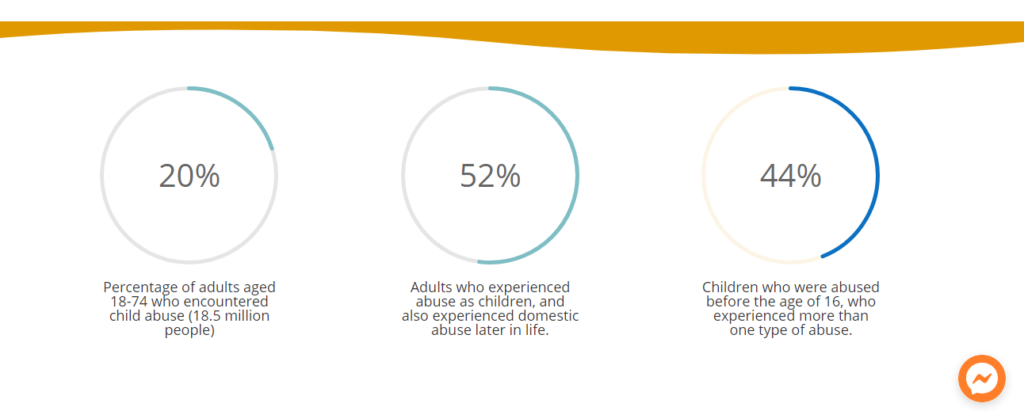
In wanting to convey statistics, but with a great design element I used the Divi Counter Circles module which allows you to share a number or percentage up to 100, with a description underneath. Because the circle’s load as the page loads, it really draws your eye to them and displays what could be deemed as mundane stats in a really nice way. You can also see a floating button in the bottom left corner, this is linked to Facebook Messenger so anyone on the site can leave me a message or get into a conversation with me if I’m online. As it floats, it stays nicely in the corner as the visitor moves around the site. The orange border takes the colours from the brand and is a nice separator from other blocks of content.
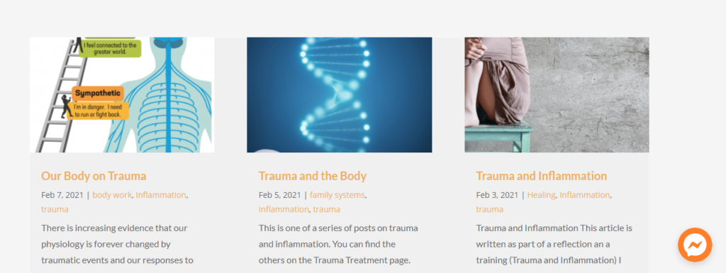
This section pulls in blog posts that are relevant to the subject of the page – trauma, inflammation and healing. You can use categories on your blogs so that only certain blog posts appear on certain pages, making your website appear dynamic by writing an occasional new post! The reader can choose if they want to read more, and click into the blog post for the full articles. You can really add focus to your niche by writing about it and sharing information.
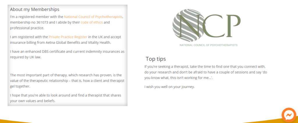
On the About page, I’ve written about my own experience of therapy and included my memberships and links to directory pages. You can see that I’ve shadowed one of the boxes to make it stand out a little bit more. I do love the clean design of the site, and although I have a plan for enhancements moving forwards, I’m happy with it for now!
I would say that this is a more mid-range website in terms of costs. Obviously, I not only design, build but also write content for the site too. Hopefully it has given you some ideas about how you might present different areas of your website, always thinking about how the user will experience it. If you’d like to discuss getting set up to build your own website, or have one designed for you – please do get in touch.


0 Comments